June 16, 2015
Room of the Week: Nicky Haslam
Lately I have been obsessed with a hue one might describe as "lavender grey." Fresher than puce, but with more edge than lilac.
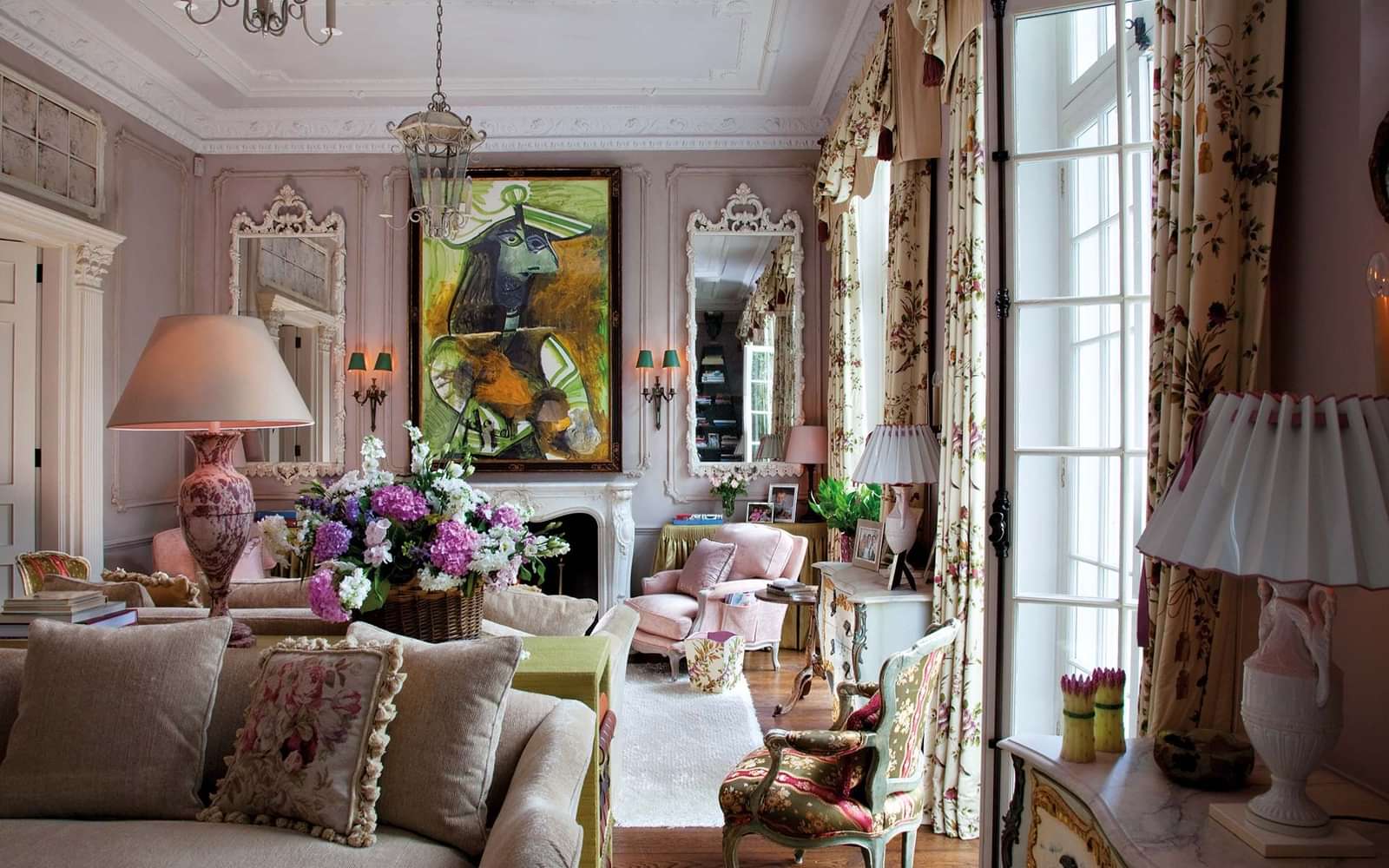
If everything I feel about this color could be transposed into a room, it would be this one designed by Nicky Haslam for a prominent art collector. Nicky's creative director Colette van den Thillart told me Nicky calls the color "ashes of mauve." "It's a VERY chalky specialist finish… It is indeed a lavender grey but made more ephemeral by the specialist BARELY there texture."
There isn't anything I don't love here: that it's a London residence with a country house vibe (given off by the floral curtains); the pleated lamp shades threaded through with ribbon; the ceramic asparagus; the chalky white mirrors and moldings; the slightly off-palette upholstery used on a pair of fauteuils which, as Mario Buatta taught me, makes the room look like it evolved over time; and of course the spectacular Picasso over the mantel. Here a Madeleine Castaing maxim comes to mind: that every room should have something ugly in it. Its rawness and "unpretty" earthy colors add a frisson and make the room anything but old fashioned.
Top photograph by Derry Moore for Architectural Digest. The project appeared in the December 2010 issue.


